
New Website
We are happy to release a new version of the Appamini web site. The new site has been redesigned for a better desktop and mobile experience, and fits right in with the company brand guidelines.
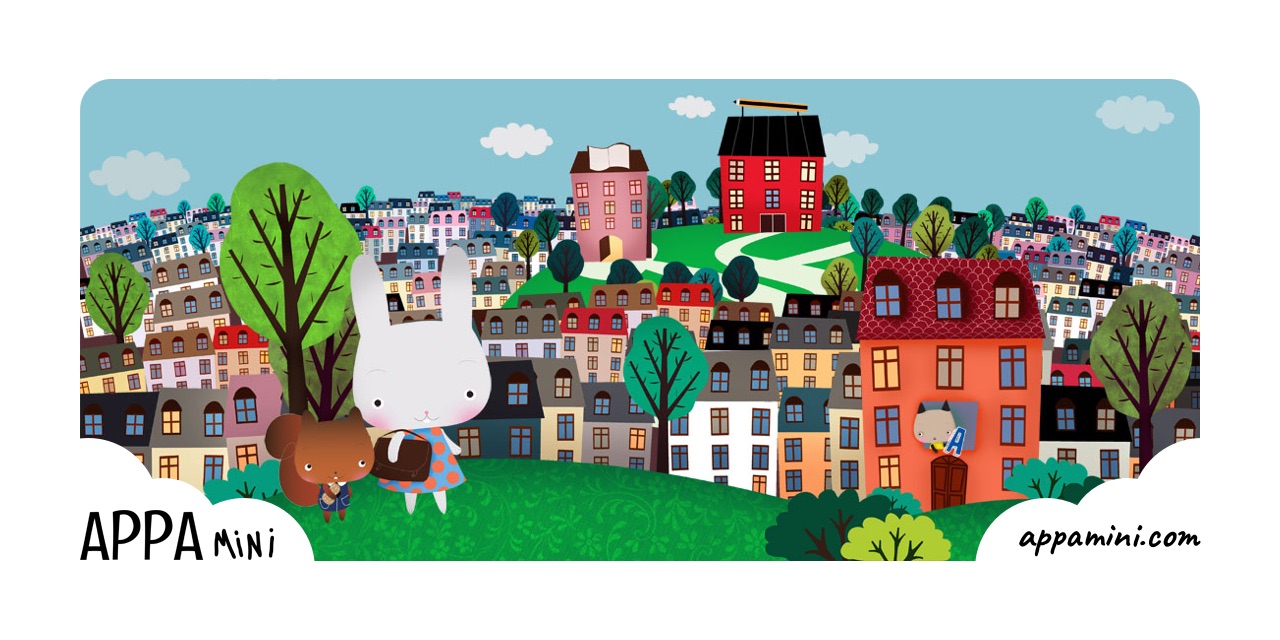
A softer, friendlier look
The most visible change is the updated cloud texture that sits at the very top of all non-content pages. It scrolls with the content, so it feels like part of the page instead of a fixed frame around it.
Headings with personality
Headings are now set in Caveat, a handwritten typeface that suits the brand far better than the geometric sans we were using before. Body copy stays in Lato, so longer passages remain comfortable to read.
A consistent app presentation
The apps are presented in an updated list item template, where the header icon is sized to match the height of that text exactly, so every app lines up on the same rhythm no matter how long its name is.
Below each header sits a screenshot, a short description, the languages the app is available in, and a direct link to the App Store.
Built to grow
The apps on the site are now driven by a single data file rather than hand-written pages. This makes keeping the information up to date easy as the Appamini family grows.
We hope you enjoy the new site. If you spot anything that looks off, we would love to hear about it.
Discussions & More
If you found this interesting, please share your thoughts on Bluesky and Mastodon. Make sure to follow to be notified when new content is published.